Logo

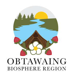
Our logo is designed to symbolize the values, vision, and work of our organization and the collective efforts of our partners in the region. The logo represents the heart of OBR’s mission, to foster collaboration, connection, and growth within our communities.
Key Components of the Logo
The design of our logo incorporates meaningful symbols that align with our mission. Each element has been thoughtfully chosen to reflect the work we do. At the core of the design, the logo represents OBR as a space where communities come together to collaborate, learn, and share.
Zhingwaak (White Pine Trees): The white pine trees represents an important species in the region and symbolizes our resilience.
Ode’imin (Heart Berry or Strawberry): The strawberry, often called the “heart berry,” representing that relationships are at the heart of what we do.
Canoe: The canoe reflects the shared nature of our work.
Sunset or Sunrise: The depiction of the sun, whether rising or setting, serves as a symbol of the ongoing cycle of growth.
Joining of Water and Land: The union of water and land in the logo represents the balance between nature, people, and the environment. It represents the interconnectedness of all things.
We are grateful for all OBR partners who have contributed to ensuring that this logo is representative of all that OBR has to offer. A special thank you to Eva Oldman with Creative Graphics by Eva, who brought our vision to life through the design of this logo.
